
Reworking a Home Layout Without Adding Square Footage
While additions can expand and open up a home’s existing footprint, adding square footage is not always in the cards for homeowners. Whether due to financial or zoning constraints, or simply a desire to maintain the original footprint of the home, many homeowners opt to re-arrange their existing layout instead of adding on to create their forever home. In this article, we highlight how rearranging a home’s floorplan can create beautiful, functional, and open spaces that improve a home’s liveability for generations to come.
Reimagining an Outdated Home Layout
“It all started with small, outdated, 1990s pickled oak cabinets in a quintessential mid-century home,” says Gina Vozka, AIA Architect + ASID Interior Designer for the Mid-Century Creekside Renewal. The original layout of this Golden Valley home was outdated and cramped, and no longer suited to the needs of a growing family. With a desire to comfortably host the entire family, the homeowners looked to TreHus to re-arrange their layout and create a forever home better suited to the way they lived. Rather than adding on, the remodel focused on making better use of the space already there. By opening up the kitchen, expanding the primary suite, and transforming an underused room into a home library, all without adding any square footage, this Golden Valley home now offers more room for the family to gather together for generations to come.
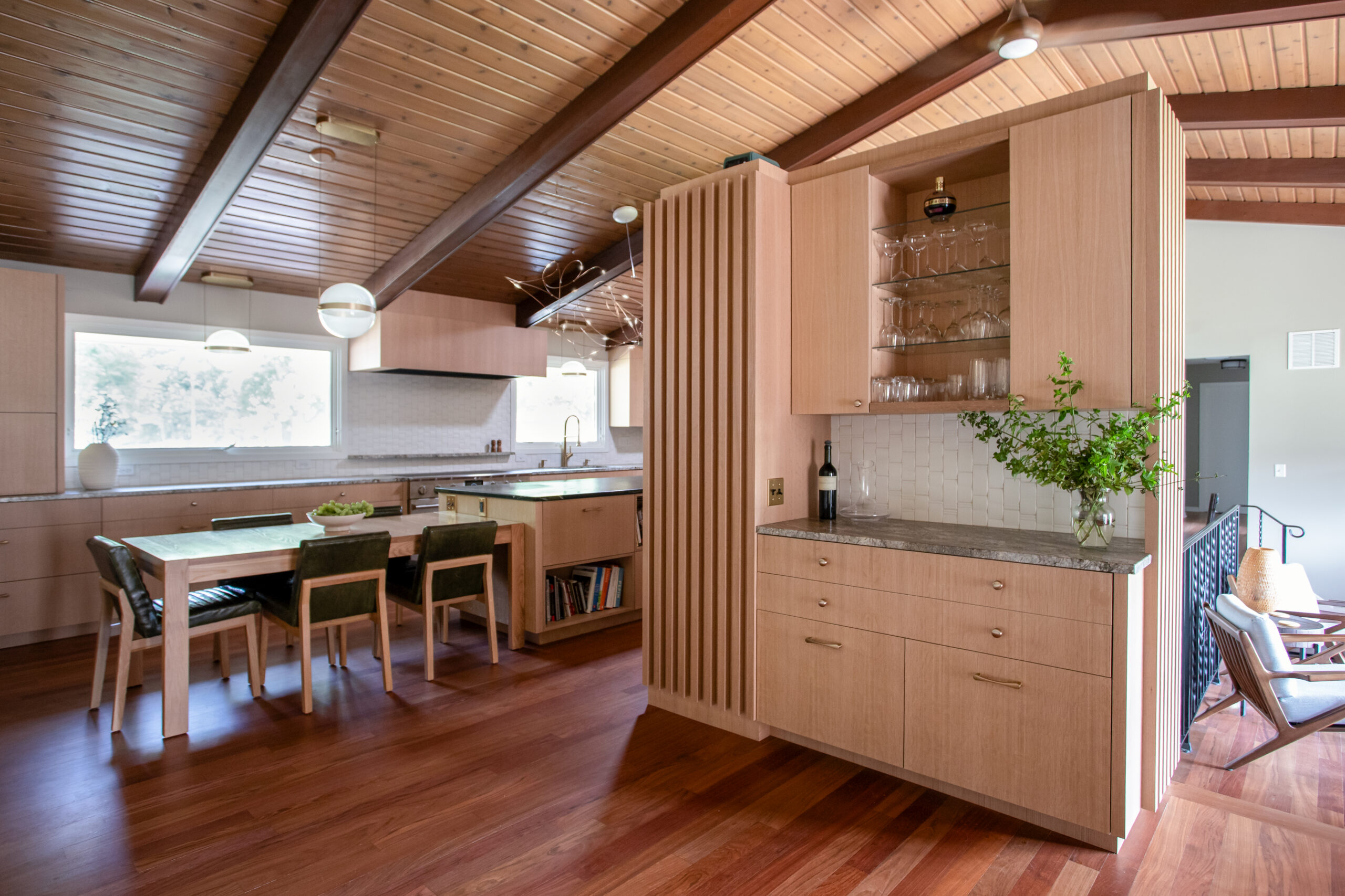
Creating a More Functional Kitchen and Gathering Space
To open up this home’s layout and create a welcoming space for loved ones to gather, Gina utilized color, texture, and a variety of non-traditional lighting to add depth without cluttering the interior. Connecting the kitchen to the surrounding living spaces created a stronger relationship between the places where the family cooks, eats, and gathers, making the existing footprint feel more spacious and functional without increasing its size.
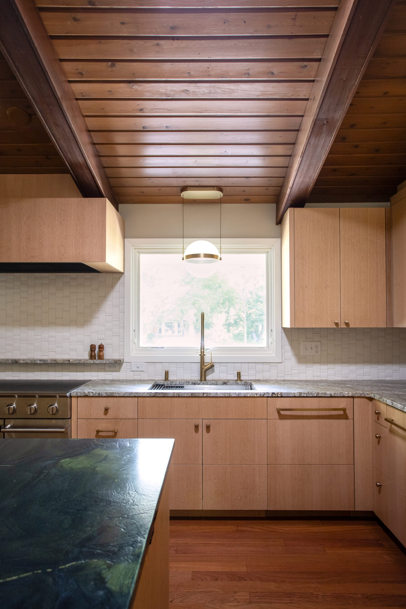
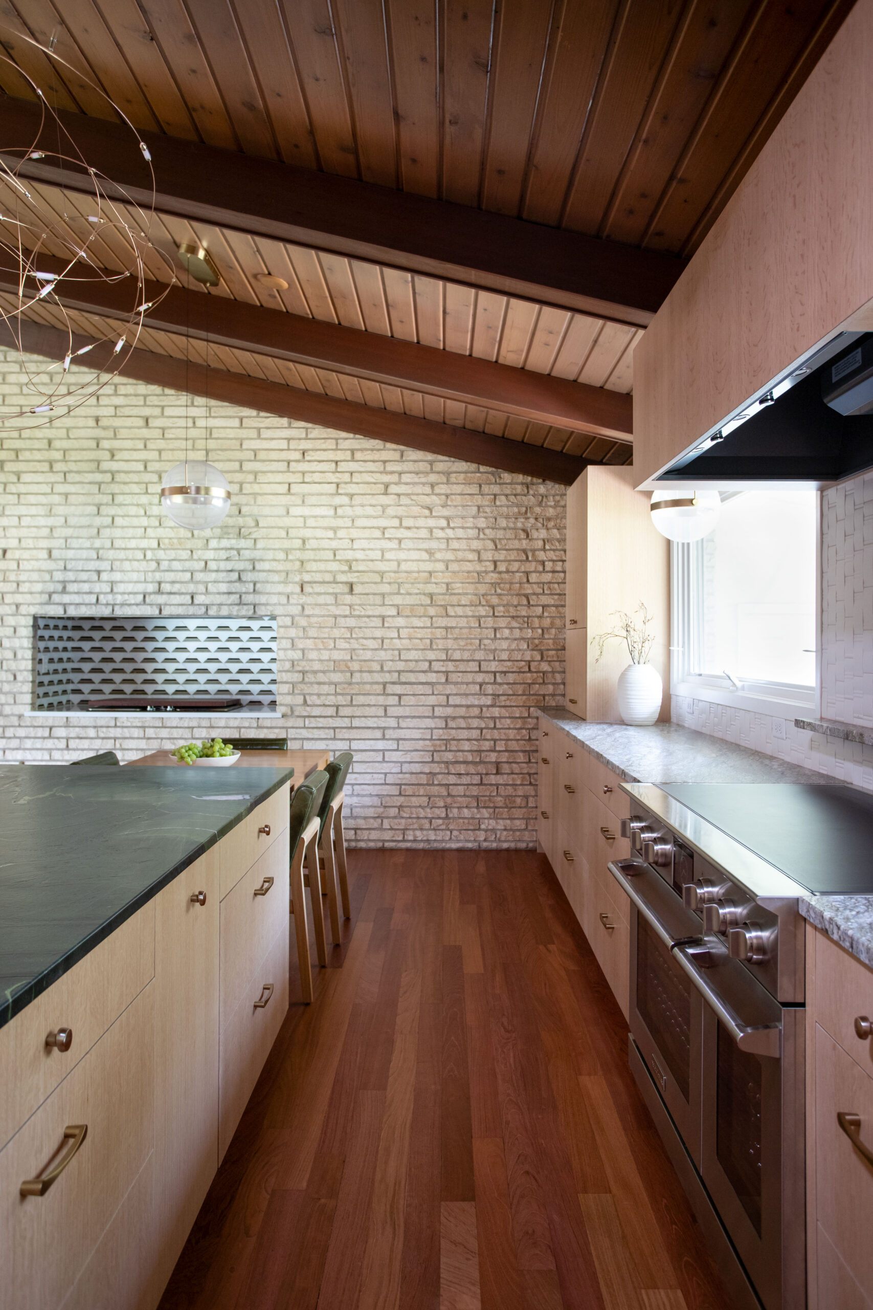
A three-dimensional white tile backsplash adds subtle interest against the bolder green and white countertops, while leathered stone and quartersawn cabinetry introduce warmth and texture. Vertical wood detailing extends from the kitchen entry to the end of the bar, creating continuity within the open space. Rather than projecting into the vaulted ceiling, the cabinetry steps back at the top. “These lines of the step back illustrate the connection of the wall and vaulted ceiling,” explains Gina. The clean lines also conceal the fact that the hood and oven range are not perfectly symmetrical between the windows. Four distinct layers of lighting — undercabinet lighting, uplighting above the cabinetry, dining pendants, and the sculptural Moooi island pendant — further define the open gathering space.
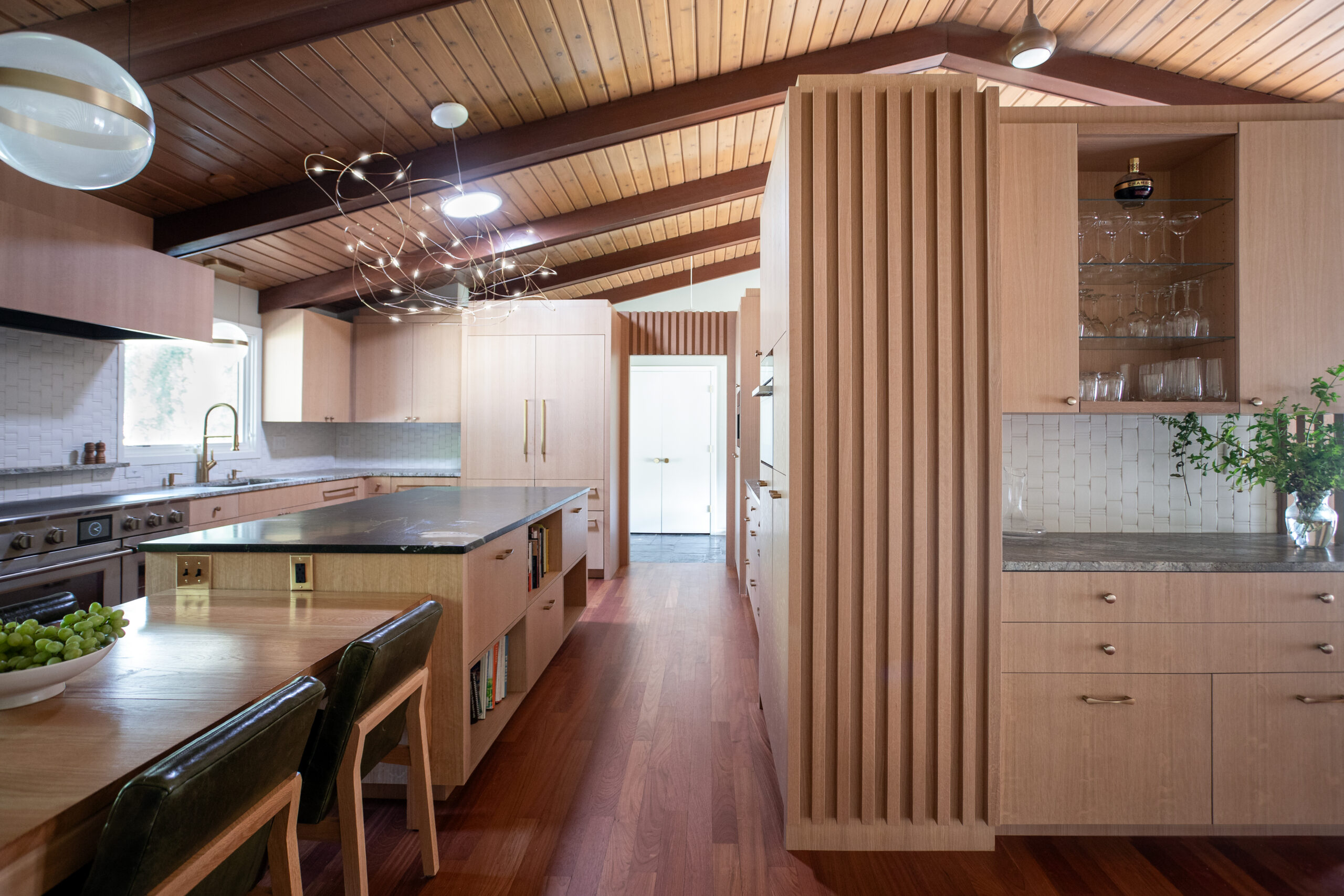
Transforming an Underused Room into a Home Library
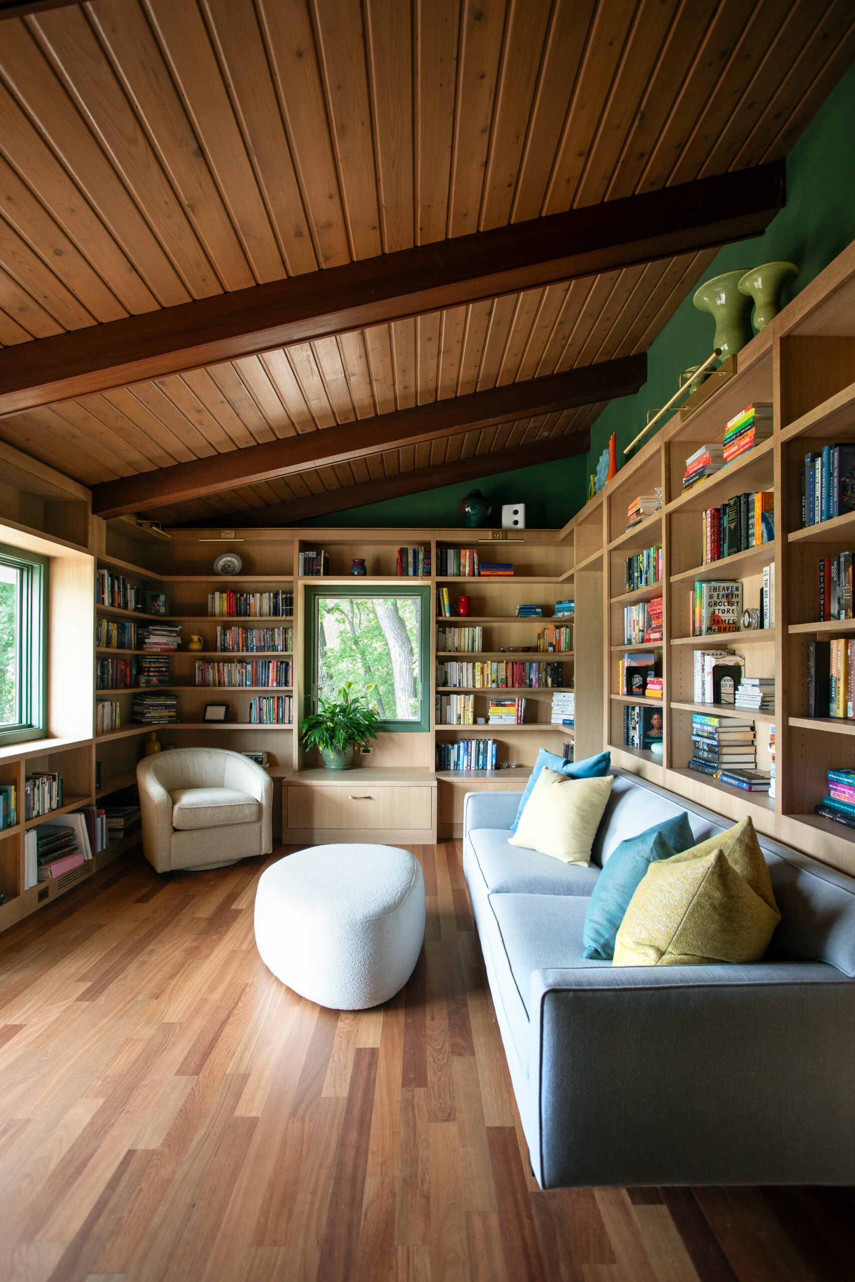
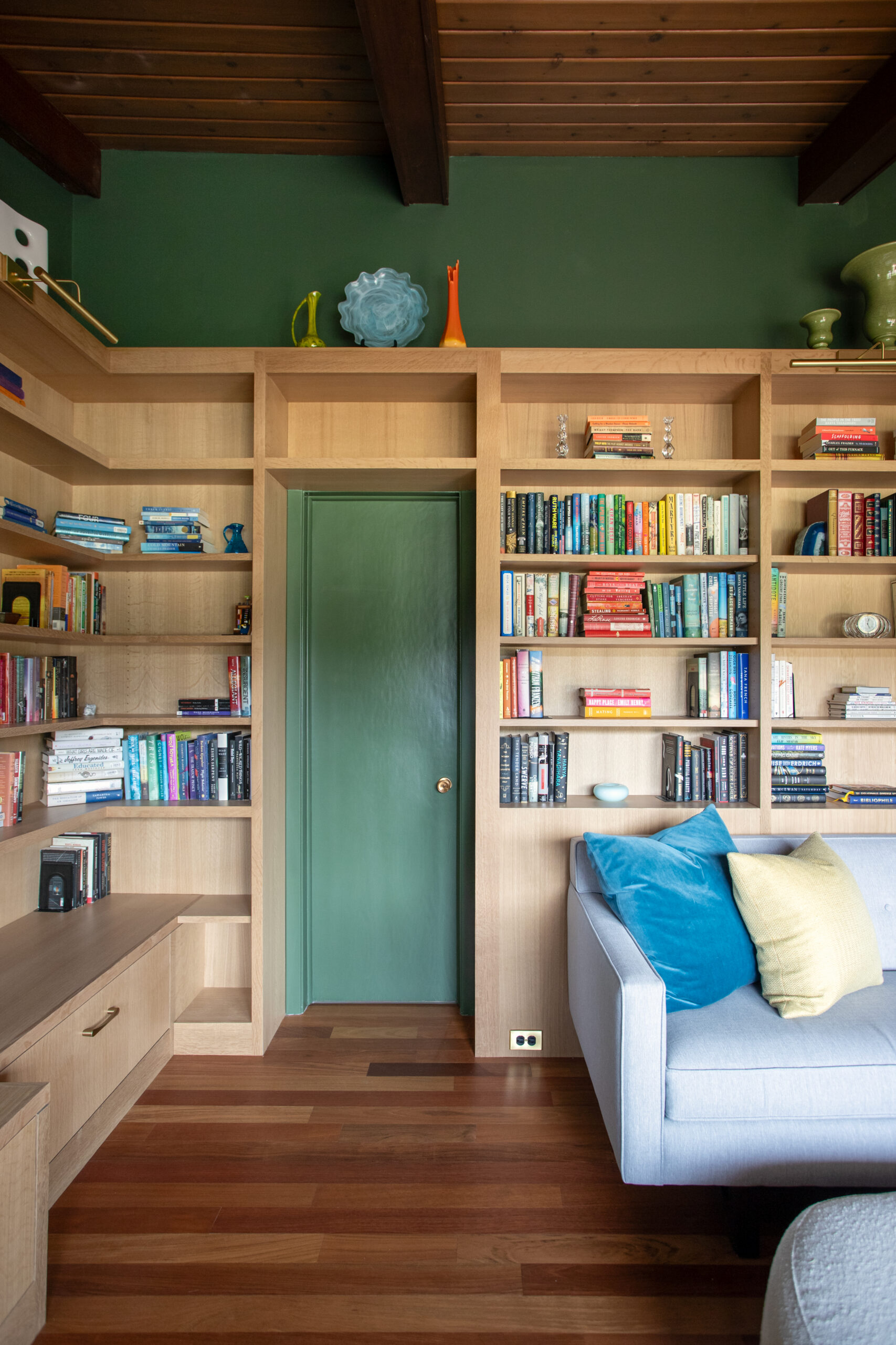
From a “freezing cold room” to a reader’s paradise, this library is the hobby haven of the home. An underused room beside the living area gained purpose by replacing oversized sliding doors with a door-and-window assembly, improving performance while creating more wall space for a floor-to-ceiling birch library. By giving an existing room a clear purpose rather than adding a new one, the remodel created another dedicated space for the family within the home’s original footprint. With vast shelves spanning most of the wall space in the room and wood paneling on the ceiling, clean, geometric lines create continuity between the kitchen and the rest of the home. Gina explains that the unique look of the wood in the library comes from the cleaner grain of birch, while “the remainder of the room is color drenched to show off the cabinets and their contents.”
Reimagining the Primary Suite
This primary suite does not sacrifice dramatic flair for functionality. Lacking a full bath and adequate storage, the primary suite was expanded by incorporating an adjacent bedroom rather than adding onto the home. This shift in how the existing rooms were used created space for a more complete primary suite while keeping the home’s overall footprint intact.
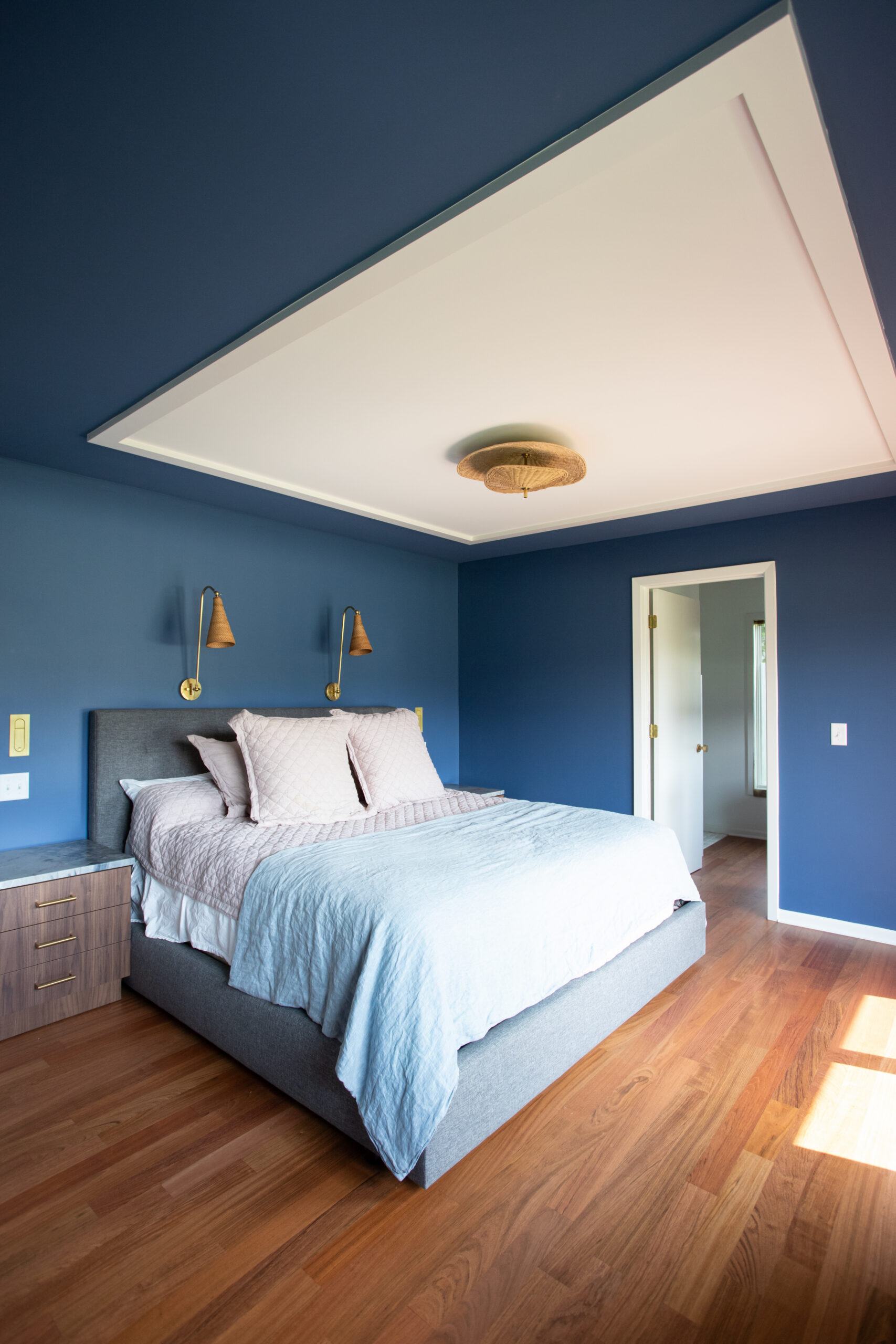
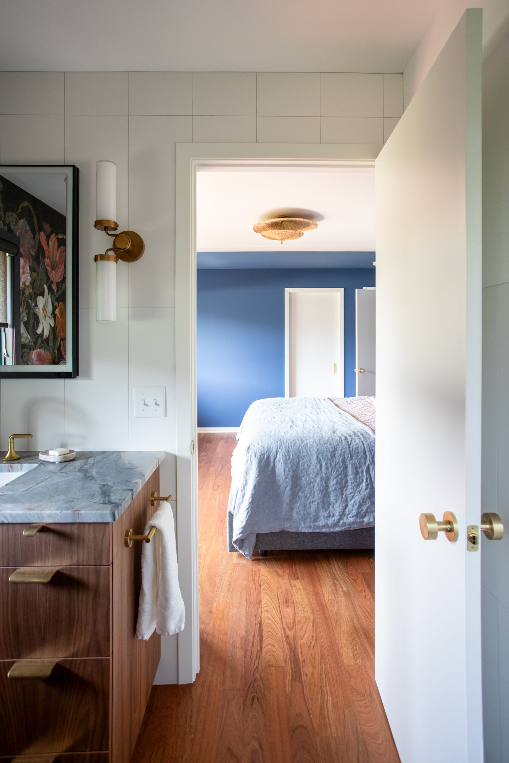
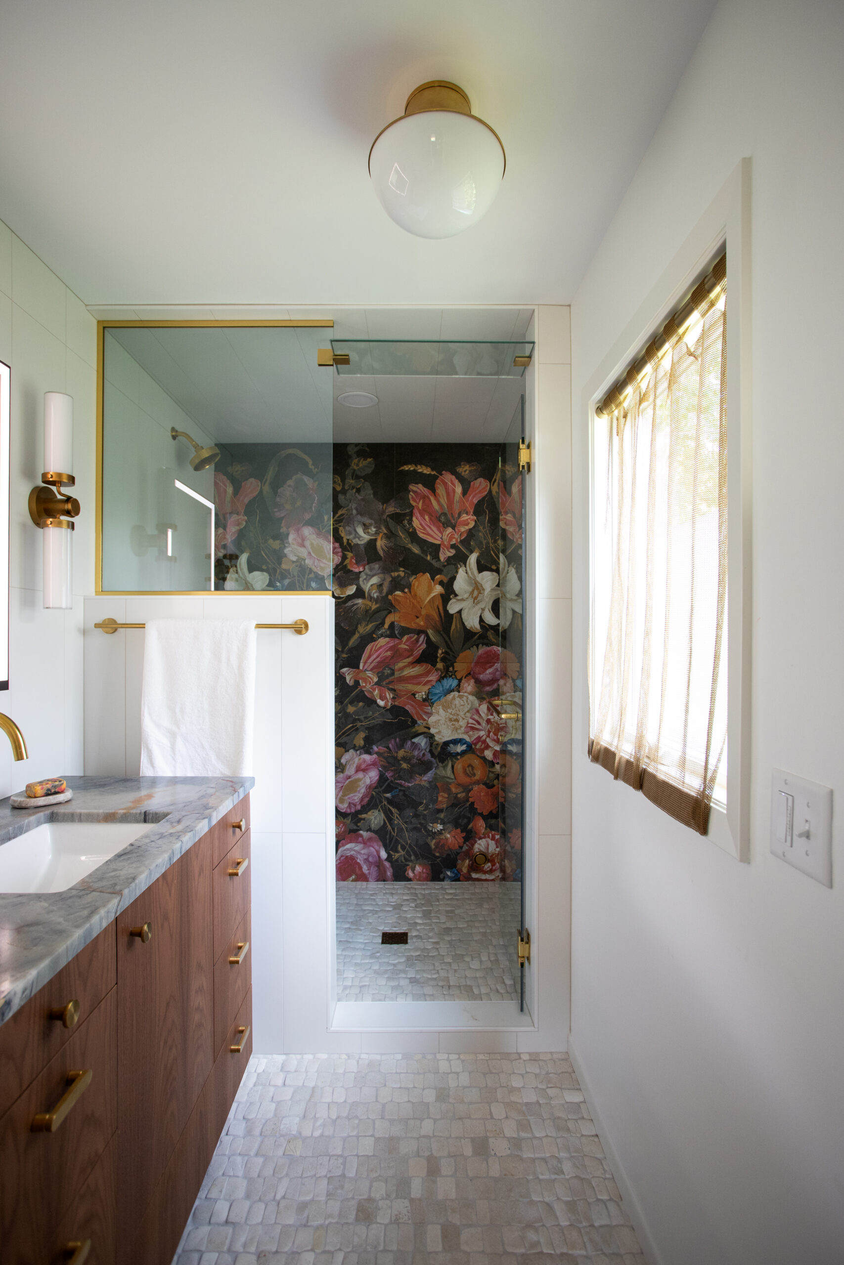
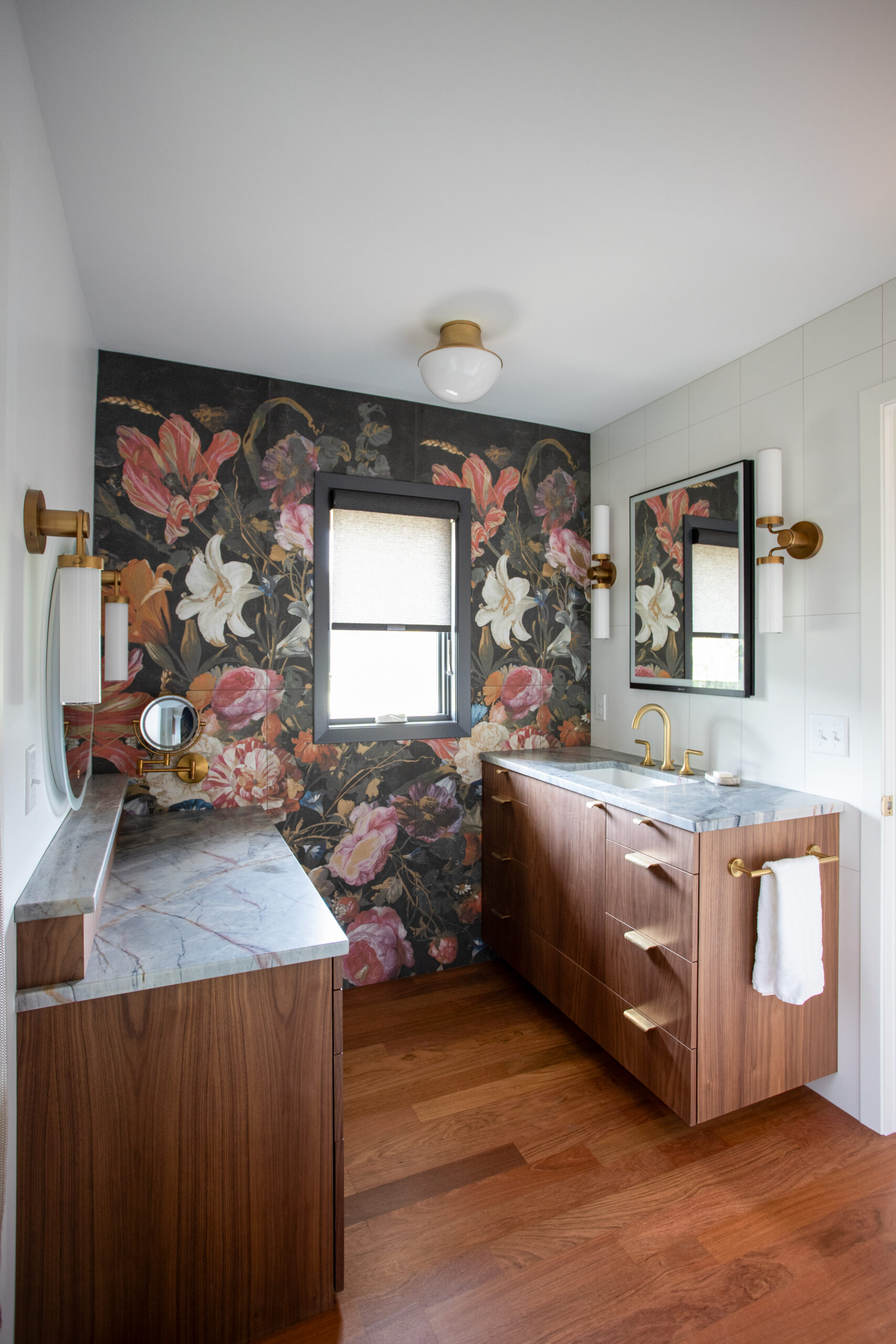
A bold blue bedroom transitions through a white mini-coffered ceiling into a bath Gina describes as “bookended by an amazing large format mural tile; full of dark colors, dramatic flowers and a shimmer of gold, while the rest of the room is a solid contrasting white.” Dual vanities and a steam shower add function, while walnut cabinetry and gold accents bring warmth to the space. Tactile elements, including the three-dimensionality of the mural tile, stone flooring, and gold chainmail drapery, add visual interest through contrast. Durable materials throughout the suite support the demands of everyday life, while the new layout provides the comfort and space the original suite could not.
Making More of the Home That Already Exists
Through color, texture, and layout, this remodel preserves the character of the mid-century home while creating a more functional home for generations to come. The vaulted ceilings, exposed beams, and original proportions remain, while previously cramped or underused spaces now support gathering, reading, and rest. By rethinking how the existing rooms could serve the family, TreHus created more usable space without building outward. The result is a home that feels more open, connected, and complete — proving that creating a forever home does not always require adding onto the home itself.