
A Firm Foundation: Rearranging a Home Layout without Adding On
Not every dream home renovation requires a bigger footprint. For homeowners facing zoning restrictions, budget constraints, or simply a desire to preserve their home’s original character, reworking an existing layout can unlock the same functionality and flow as a full addition. The key lies in strategic redesign: reimagining how existing square footage is used, rather than expanding where it ends. In this article, we explore how one Minneapolis family transformed a dated, cramped 1990s layout into an open, functional forever home — without adding a single square foot.
Reimagining an Outdated Home Layout
“It all started with small, outdated, 1990s pickled oak cabinets in a quintessential mid-century home,” says Gina Vozka, Senior AIA Architect + ASID Interior Designer for the Mid-Century Creekside Renewal. The original layout of this Golden Valley home was outdated and cramped, and no longer suited for the needs of a growing family. The homeowners sought updated functionality while preserving the vaulted ceilings, exposed beams, and original proportions, and the challenge was creating spaces for gathering and daily life within the existing structure. With the desire to comfortably host the entire family, the homeowners looked to TreHus to re-arrange their existing layout to create the forever home of their dreams. By opening up the kitchen, expanding the primary suite, and renovating the in-home library all without adding any square footage, this Golden Valley home now boasts enough room for the large family to gather together for generations to come.
Creating a More Functional Kitchen and Gathering Space
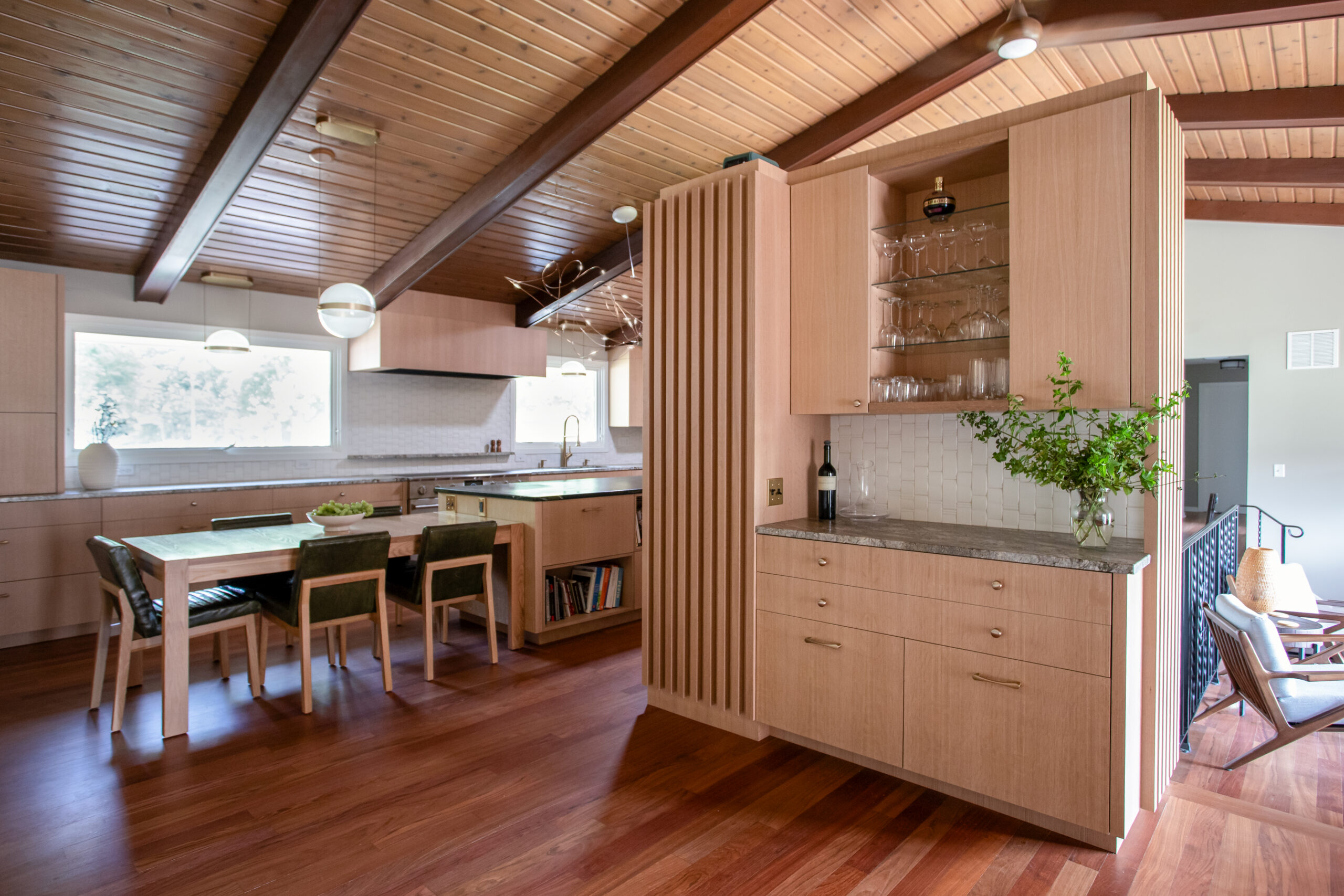
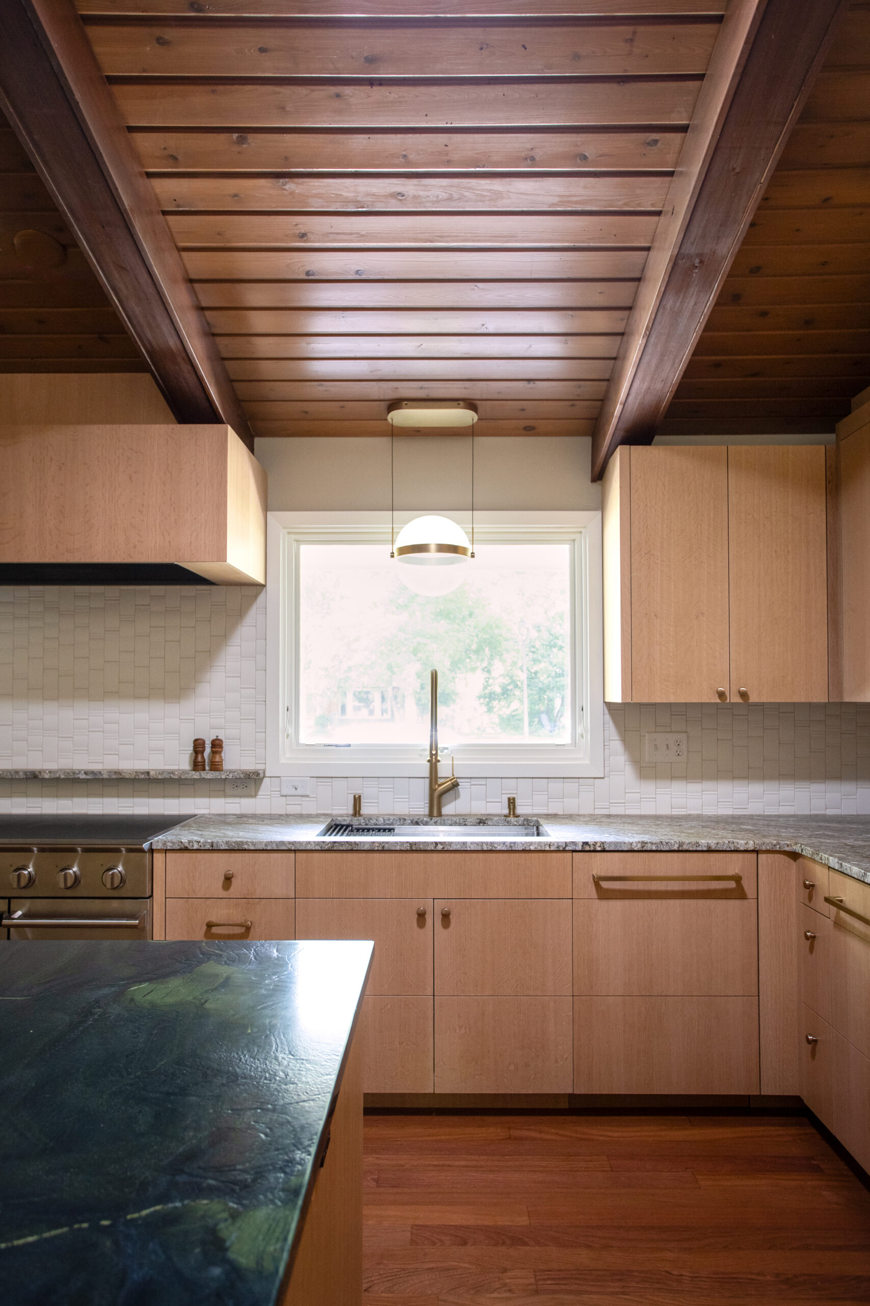
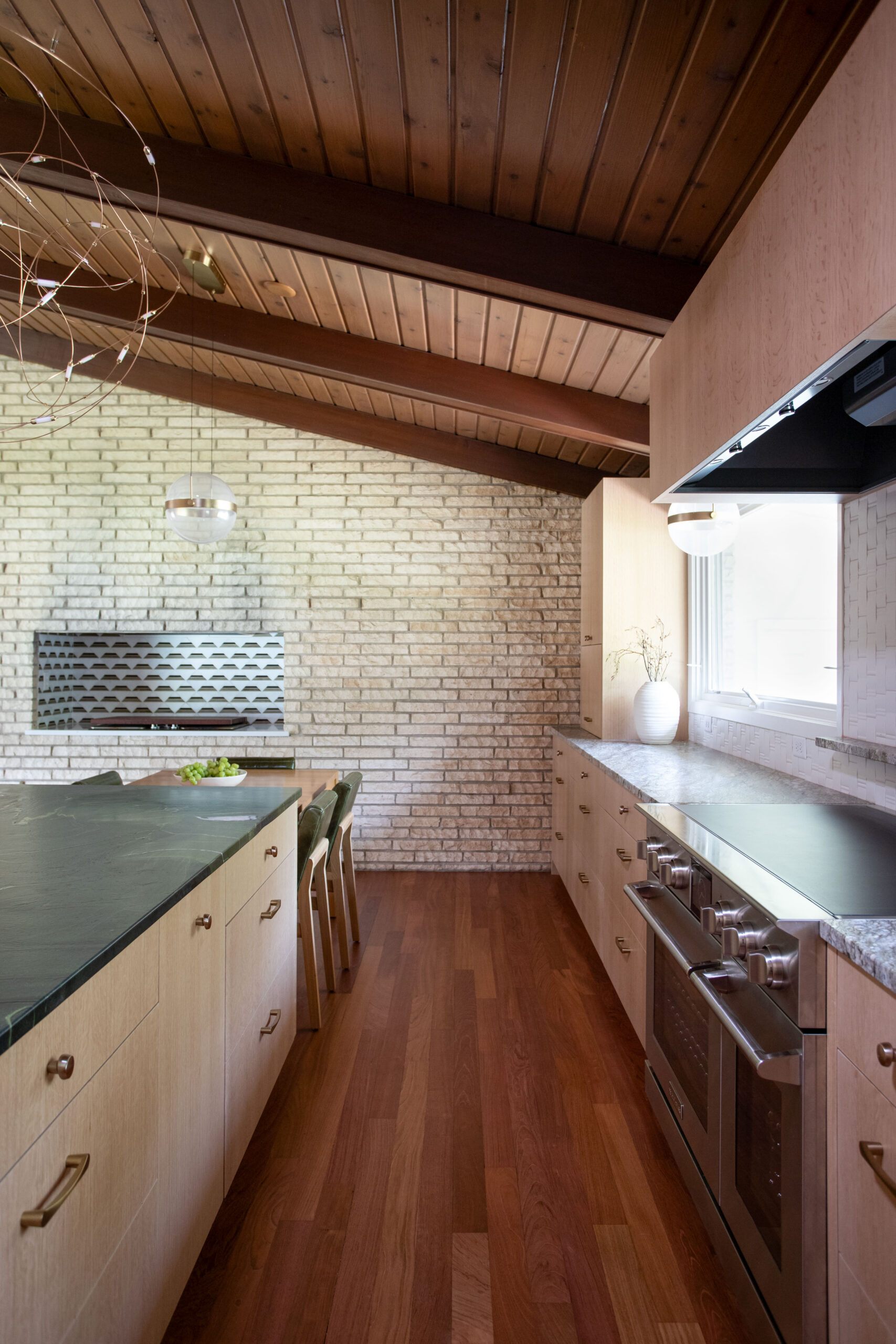
To open up the home’s layout and create a welcoming space for loved ones to gather, Gina used color, texture, and a variety of non-traditional lighting to add depth without cluttering the interior. A three-dimensional white tile backsplash adds subtle interest against the bolder countertops and softer cabinets, while a leathered finish on the countertops and a vertical wood pattern — running from the kitchen entry to the end of the bar — add further texture. The clean lines of the cabinetry are offset by a quartersawn texture, and bold green and white countertops offset the simpler, natural warm tones of the cabinets, with white accents echoing the warmth of both the color palette and the stone. Vertical wood detailing finishes the cabinets against the open ceiling with a step back rather than a step forward; “these lines of the step back illustrate the connection of the wall and vaulted ceiling,” explains Gina, “the clean lines hide the hood and oven range not being truly symmetrical between the windows.” Four distinct layers of lighting complete the space: undercabinet lighting, uplighting atop the cabinetry into the vaulted ceiling, the simple geometry of the dining pendants, and the dramatic, sculptural contrast of the Mooi island pendant.
Transforming an Underused Room into a Home Library
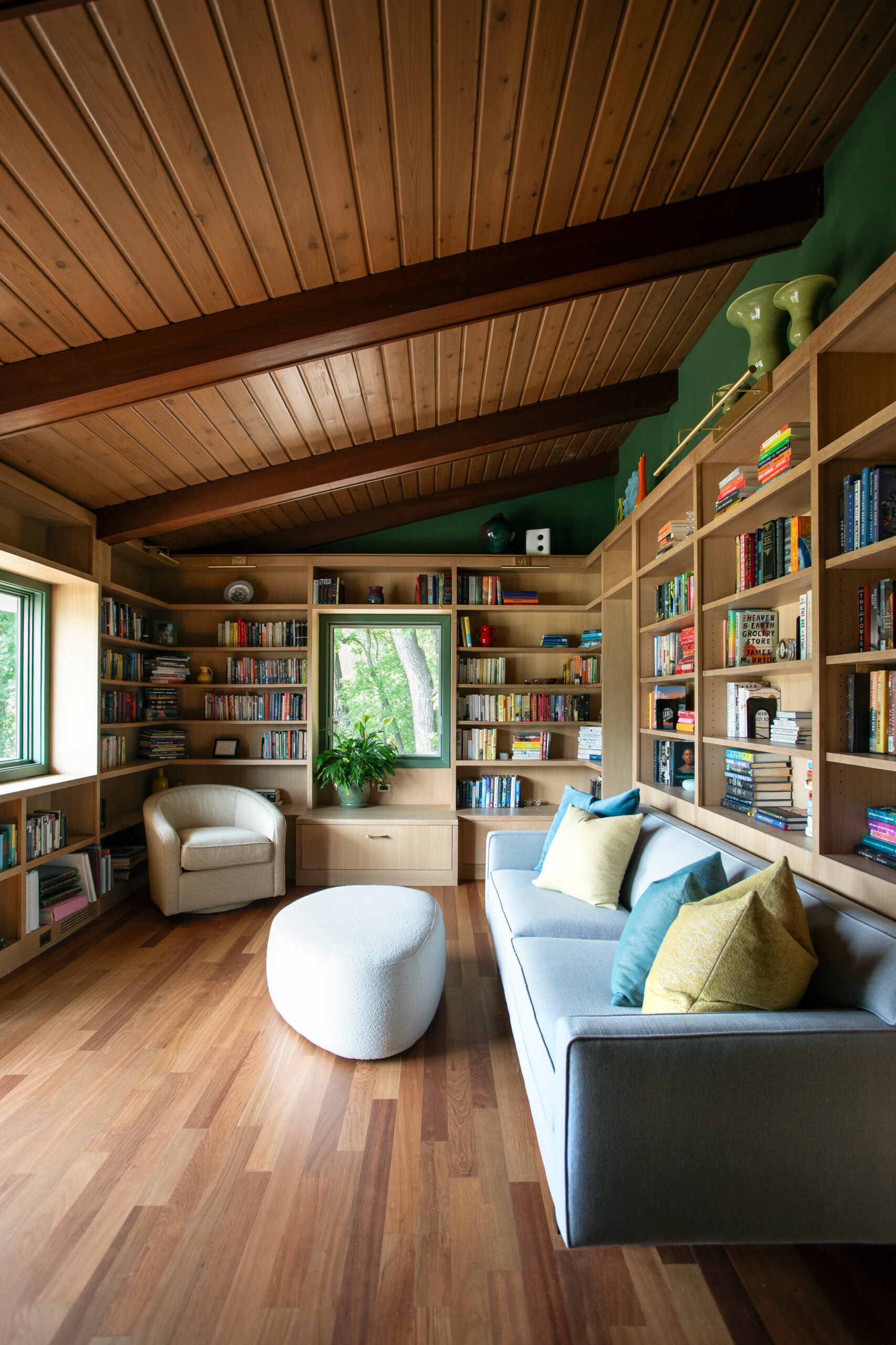
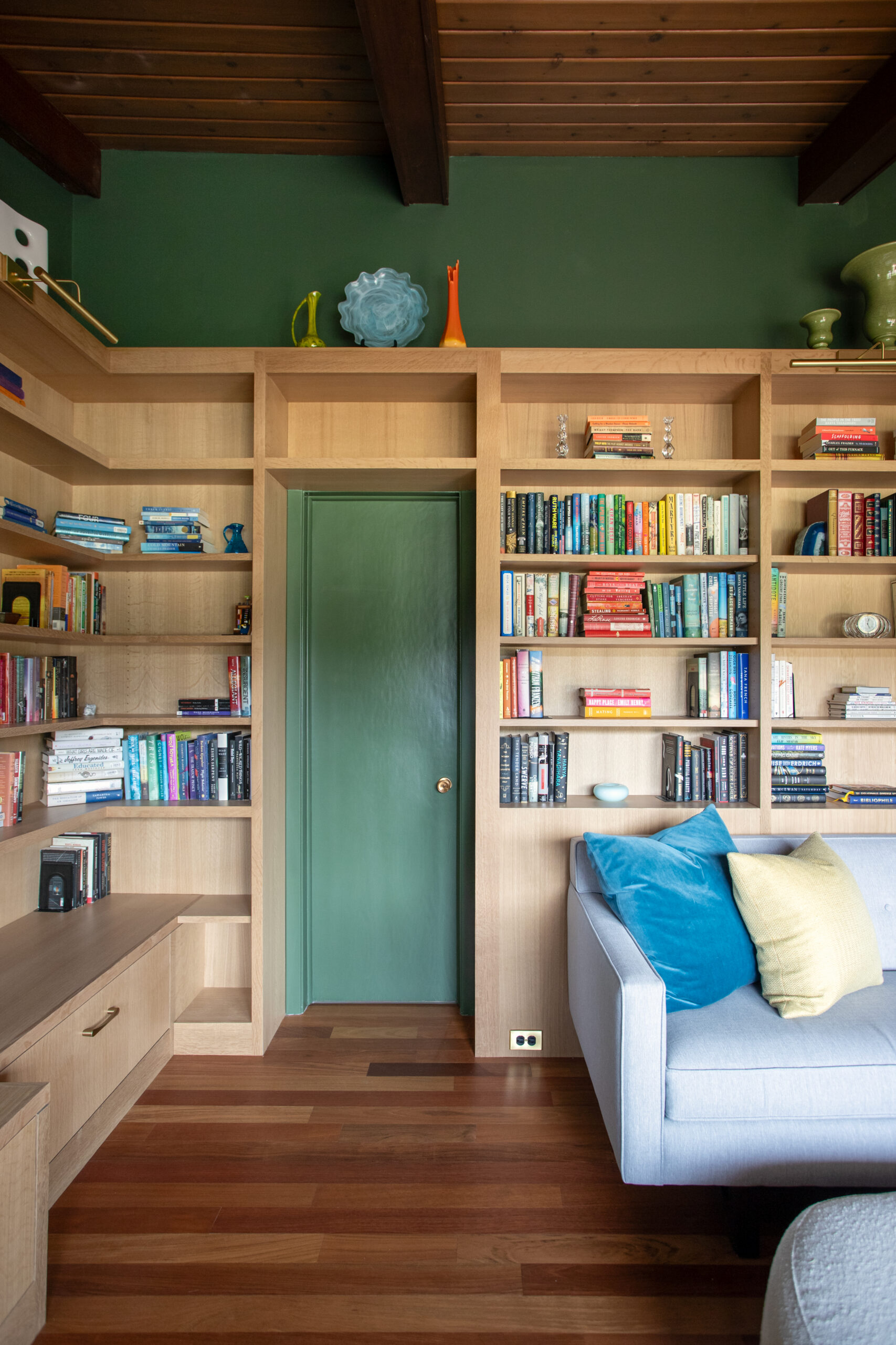
From a “freezing cold room” to a reader’s paradise, this library is the hobby haven of the home. An underused room beside the living area gained purpose by replacing oversized sliding doors with a door-and-window assembly. The change improved performance while creating wall space for a floor-to-ceiling birch library, echoing the kitchen cabinetry. With vast shelves spanning most of the wall space in the room and wood paneling on the ceiling, clean, geometric lines create continuity between the kitchen and the rest of the home. Gina explains that the unique look of the wood in the library is from the cleaner grain of birch, while “the remainder of the room is color drenched to show off the cabinets and their contents.”
Reimagining the Primary Suite
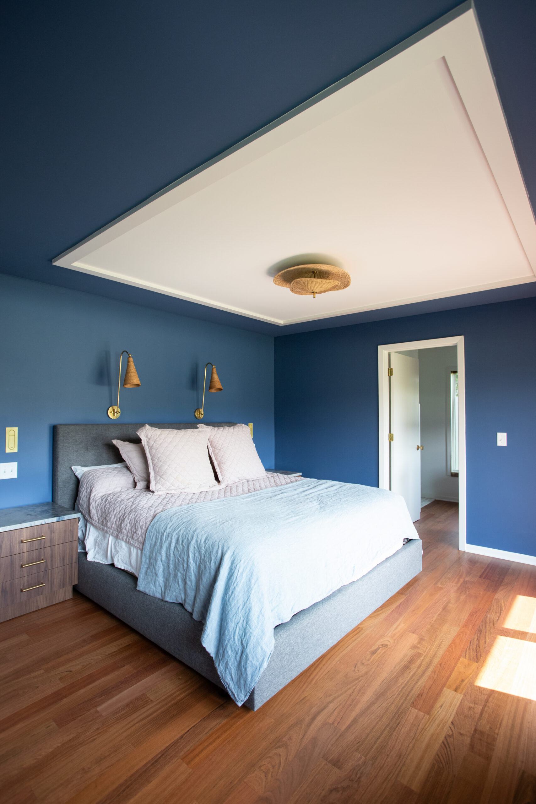
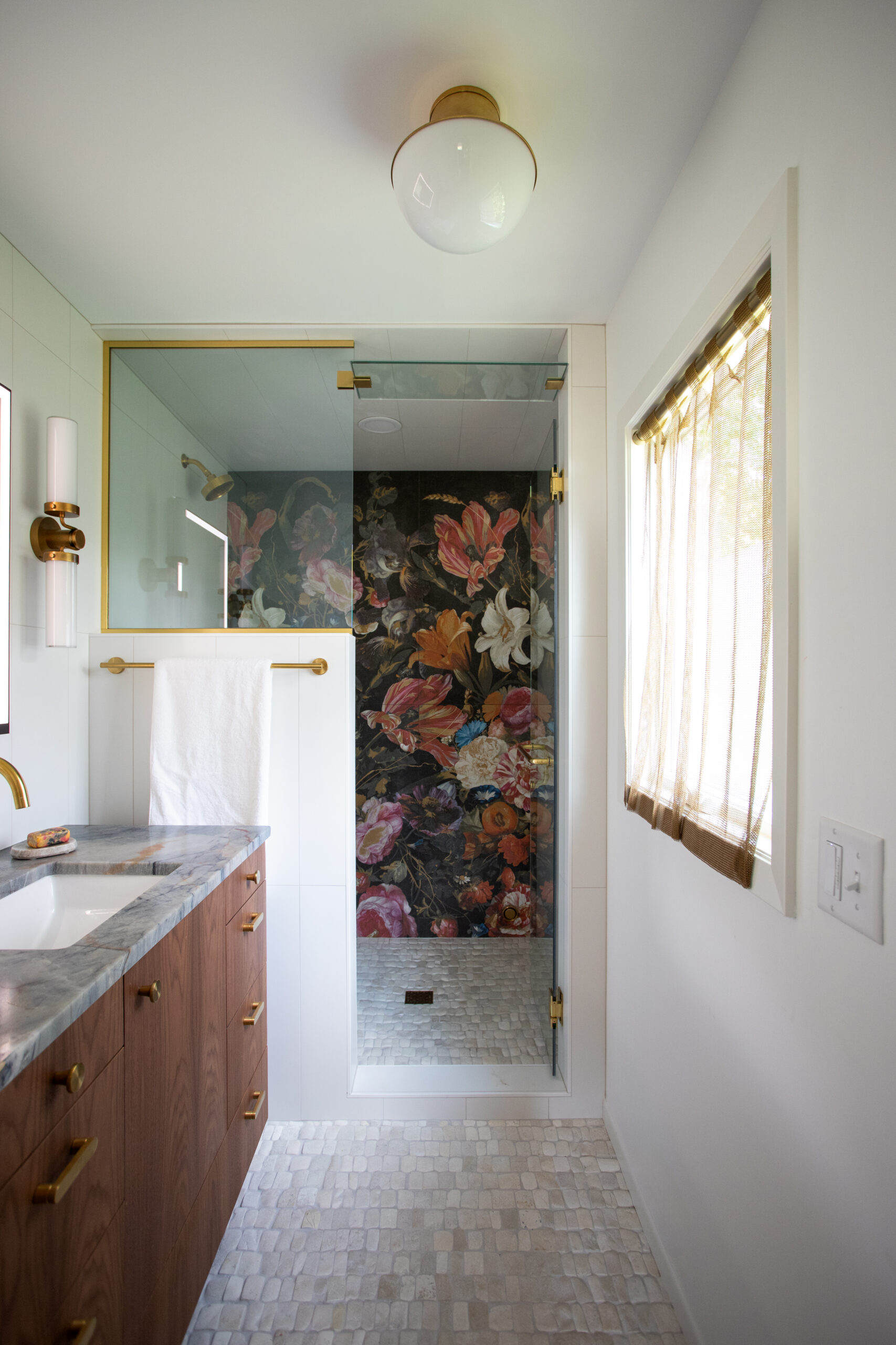
This luxurious primary suite does not sacrifice dramatic flair for functionality. Lacking a full bath and adequate storage, the primary suite was expanded by incorporating an adjacent bedroom. A bold blue bedroom transitions through a white mini-coffered ceiling into a bath bookended by an amazing large format mural tile — full of dark colors, dramatic flowers, and a shimmer of gold, with dual vanities and a steam shower, while the rest of the room is a solid contrasting white. Walnut cabinetry and gold accents add warmth, while tactile elements such as the mural tile’s three-dimensionality, the stone flooring, and gold chainmail drapery add visual interest through contrast in this vast primary suite, with materials that can stand up to the daily demands of the home’s most relaxing space.
Through color, texture, and layout, the Mid-Century Creekside Renewal preserves the home’s mid-century character while creating a functional home for generations to come. The redesign celebrates what made the home special, including its vaulted ceilings, exposed beams, and original proportions, while reshaping how the family lives within them. A home’s potential isn’t always defined by its footprint. By rethinking how each room served the family, rather than building outward, the TreHus team transformed a dated, disconnected layout into a warm, cohesive home built for gathering, reading, and rest- a true forever home.